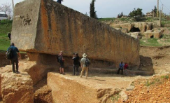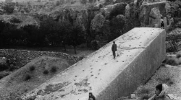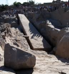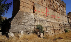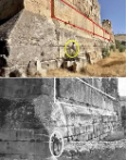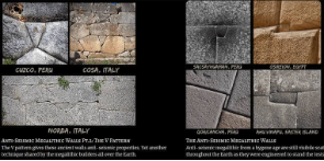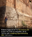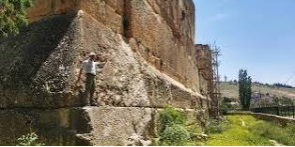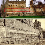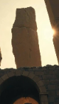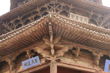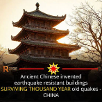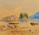
‘The architectural design features seen in Cusco and Sacsayhuamán appear across several distinct ancient civilisations globally.’

My Q. ‘Does the design and electromagnetic properties of the stone used in the megaliths of Cusco – most famously showcased at the majestic citadel of Sacsayhuamán, appear anywhere else in the ancient world?

AI – ‘Yes, the architectural design features seen in Cusco and Sacsayhuamán appear across several distinct ancient civilisations globally, though the idea of engineered “electromagnetic properties” remains a topic of alternative history and fringe theories rather than mainstream archaeology. [1, 2, 3, 4]From a scientific standpoint, the stones at Sacsayhuamán possess unique physical traits because they are composed of andesite, basalt, and diorite, which are iron-rich volcanic rocks. These minerals inherently display high magnetic susceptibility. While alternative researchers speculate that the tight, mortarless joints and specific angles act as acoustic or energy lenses, mainstream geologists attribute their layout strictly to anti-seismic engineering designed to survive earthquakes. [1, 2, 3, 4, 5, 6]The architectural design—known as polygonal masonry or cyclopean stonework—can be found in several major archaeological zones worldwide: [1, 2, 3, 4]


Global Examples of Mirror Architectural Design

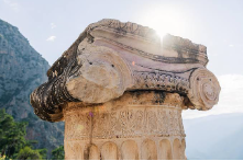
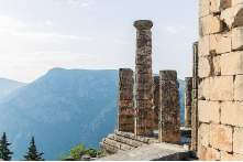
  • Greece (Mycenae and Delphi): The ancient Mycenaean civilization utilized massive, irregularly shaped blocks fitted together without mortar to build fortresses and defensive structures. The most notable parallels are found at the Lion Gate of Mycenae and the Polygonal Wall of Delphi, which feature the same precise, pillowed-edge interlocking puzzle aesthetic.
  • Italy (Etruscan and Roman Foundations): Prior to the rise of the Roman Empire, the Etruscans built massive fortifications using perfectly joined polygonal limestone blocks. Remarkable examples still stand in cities like Alatri, Amelia, and Segni, mirroring the tight seam tolerances seen in the Andes. [1, 2, 3]
  • Egypt (Giza and Abydos): While Egypt is famous for its straight-edged blocks, the interior walls of the Valley Temple of Giza and the subterranean Osireion at Abydos utilize monumental granite and quartzite blocks. These stones feature wrapped, curved corners and mortarless, interlocking joints that match the complexity of Cusco’s precision. [1, 2, 3, 4, 5]
  • Japan (Edo-Period Castle Foundations): The stone bases of Osaka Castle and Kumamoto Castle employ a technique called Ano-zumi. This involves utilizing heavily compressed, mortarless polygonal stones specifically engineered to withstand severe seismic activity—utilizing the exact same physics as the Inca builders. [1, 2, 4]
  • Easter Island / Rapa Nui (Ahu Vinapu): Closer to Peru, the ceremonial platform at Ahu Vinapu showcases stone masonry that is so nearly identical to Cusco’s structures that early explorers hypothesized a direct oceanic contact between the two cultures.

Directly Comparing the Architectural and Material Properties

RegionPrimary Site ExampleMasonry StyleMain Material UsedConfirmed Engineering Purpose
Cusco, PeruSacsayhuamán CitadelPolygonal / CyclopeanAndesite, Diorite, LimestoneSeismic shock absorption and stability.
Giza, EgyptValley TempleMegalithic / AshlarGranite, QuartziteStructural weight bearing and longevity.
Mycenae, GreeceLion Gate FortressCyclopeanLimestone, BrecciaDefensive fortifications and terrain retention.
Lazio, ItalyAlatri AcropolisPolygonalLimestoneFoundations built for defensive longevity.
Osaka, JapanOsaka Castle BaseAno-zumi (Polygonal)GraniteEarthquake resistance via flexible dry-stacking.

The Reality Behind the “Electromagnetic” ClaimsThe claim that these ancient walls are energetic grids usually stems from the presence of vitrification (a glassy, highly reflective sheen found on some stone faces) and piezoelectric minerals like quartz. When pressure is applied to quartz-bearing rock, it generates a microscopic electrical charge. Because these sites sit on major geological fault lines, natural tectonic forces compress the stones, creating measurable localized magnetic anomalies. However, there is no peer-reviewed historical or archaeological evidence proving that ancient civilisations deliberately selected or arranged these stones to harness or manipulate electromagnetic energy fields. [1, 2, 3]If you would like to explore this topic further, would you prefer to look deeper into the quarrying techniques used to cut these hard minerals, or examine the transoceanic theories connecting these architectures? [1]

The Egyptians, Inca, and Rapa Nui achieved laser-straight edges and vacuum-tight joints without modern tools, we have to look past the tools themselves and look at the physics of materials.

When you do not have hardened steel, you must rely on three core principles: the Mohs scale of hardness, fracture mechanics, and repetition. Here is exactly how each civilization used friction, physics, and patience to conquer stone. [1, 2, 3]


🏜️ 1. The Egyptians: Abrasive Friction & Hydraulic PowerThe builders of the Valley Temple of Giza and the Osireion at Abydos faced a massive challenge: cutting and shaping granite, which ranks a 6 to 7 on the Mohs hardness scale. The copper and bronze tools they possessed were a mere 3 on the scale. Trying to chisel granite with copper is like trying to cut a steak with a plastic spoon—the tool simply bends and dulls.

+---------------------------+-----------------------------------+-----------------------------------------+

| Step                      | Physics / Phenomenon Used         | How It Worked                           |
+---------------------------+-----------------------------------+-----------------------------------------+

| Quarrying & Splitting     | Hydraulic Expansion               | Wet wooden wedges swelled to pop rock   |
| Rough Shaping             | Impact Energy & Fracture Zones    | Heavy dolerite balls shattered granite  |
| Precision Flattening      | "Three-Plate Method" & Abrasives  | Rubbing rocks with quartz sand & water  |
+---------------------------+-----------------------------------+-----------------------------------------+
  • The Sand Trick (Friction over Hardness): The Egyptians understood that while copper is soft, quartz sand (Mohs 7) is harder than granite. To cut straight lines, they used long, teethless copper slab saws or tubular copper drills. Workers poured a slurry of quartz sand and water into the groove. As the copper blade dragged back and forth, the sand grains became embedded in the soft copper. The copper acted merely as a guide, holding the razor-sharp sand grains in place as they ground away the granite via friction. [1, 2, 3, 4]
  • The Three-Plate Method (True Flatness): To make a block perfectly flat, you cannot just eyeball it. The Egyptians used a basic geometric principle: if you take three stones and rub them against each other in rotating pairs (Stone A against B, B against C, C against A) with abrasive sand, they will eventually grind each other down into perfectly flat planes. [1, 2]
  • Hydraulic Wedge Splitting: To harvest blocks with straight edges right out of the quarry, they cut small slots into the stone, hammered in dry wooden wedges, and poured water over them. The wood fibers absorbed the water, expanding with massive force (up to 100+ PSI), cleanly snapping the stone along its natural crystalline fault lines. [1]

⛰️ 2. The Inca: Kinetic Pounding & The “Scribe” PrincipleThe Inca at sites like Saksaywamán and Machu Picchu did not use saws or mortar. Their trademark style features giant polygonal blocks fitting together so tightly that you cannot slide a piece of paper between them. They achieved this using kinetic energy and geometry. [1, 2]

  • Progressive Kinetic Fracture: The Inca worked with diorite and granite. They used hammerstones made of dolerite or hematite, which are exceptionally dense and heavy. Instead of swinging a chisel, an Inca mason dropped or slammed these hammerstones repeatedly against the boulder. Every strike pulverized a microscopic layer of stone into dust. They started with heavy, basketball-sized hammerstones to knock off large chunks, and transitioned to tiny, golf-ball-sized hammerstones for fine detailing. [1]
  • The Trial-and-Error Inversion (The Scribe): To make two irregular stones fit perfectly, the Inca didn’t guess the shape. They positioned the first stone, then suspended the second stone above it. Using a simple marking technique (similar to a modern carpenter’s log scribe), they traced the exact contours of the bottom stone onto the top stone. [1]
  • Under-Cutting: Workers pounded away the rock on the inside of the joint, leaving only a lip of about 1 to 2 centimetres wide along the visible exterior edge. Because they only had to make that tiny outer lip perfectly match the stone beneath it, they dramatically reduced the surface area that required precision fitting.

🗿 3. The Rapa Nui: “Toki” Pickaxes & Gravity SlurryThe mastery at Ahu Vinapu on Easter Island is arguably the most impressive, because the islanders were completely isolated from the metallurgical developments of the rest of the world. They worked with hard basalt and softer volcanic tuff using pure Stone Age technology.

  • The “Toki” Chisel: Rapa Nui master carvers used hand-held chisels called toki, made from the highest-grade, microcrystalline basalt or obsidian available on the island. By constantly striking the stone at a precise 45-degree angle, they chipped away the rock. As the toki dulled, they simply flaked the edges of the tool to make it razor-sharp again. [1]
  • Basalt Slurry Grinding: To get the perfectly flat, smooth faces seen on the Ahu Vinapu platforms, the Rapa Nui used a technique called puki. After rough-shaping the blocks, they placed a slurry of water and fine volcanic sand between the stones. They then dragged a heavy basalt polishing stone back and forth. The water lubricated the movement while the sand acted as liquid sandpaper, eroding any microscopic high points until the faces were completely flush.

⏳ The Missing Ingredient: The Economy of TimeThe ultimate secret weapon shared by these three civilizations was an abundance of organized labor and a completely different relationship with time.In modern construction, time is money; tasks must be completed quickly. In these ancient societies, architecture was tied to religion, the cosmos, and the absolute power of rulers or gods.

  • A single Egyptian casing stone could take weeks of continuous, rhythmic sawing by teams of workers.
  • An Inca block might be lifted, lowered, tested, and re-pounded hundreds of times over several months before it was permanently set into a wall.

By leveraging basic laws of physics—like using harder minerals to grind softer ones, using water to expand wood, and using friction to sand down rough edges—these cultures proved that highly evolved mechanics are not required to achieve geometric perfection.

The megalithic stones used by the Rapa Nui, ancient Egyptians, and Incas do possess natural electromagnetic and physical properties. However, there is a major distinction between proven geological and structural physics and speculative pseudoscientific theories regarding how these properties were used. [1]


🌋 The Geological Science: Do the Stones Have EM Properties?All three civilizations utilized stone types that inherently possess distinct electromagnetic and physical properties: [1, 2, 3]

  • Rapa Nui (Easter Island): The Moai statues were predominantly carved from volcanic tuff (compressed ash) and basalt. Basalt is highly rich in iron and ferrous minerals. This gives certain rocks on the island, such as the famous Te Pito Kura boulder, natural ferrimagnetism. This natural magnetism is strong enough to make handheld magnetic compasses spin irregularly when placed nearby. [1, 2, 3, 4, 5]
  • Ancient Egyptians: The Great Pyramid of Giza contains thousands of tons of granite (specifically in the King’s Chamber). Granite contains high concentrations of quartz crystals. Quartz is inherently piezoelectric, meaning it generates a small electrical charge when subjected to immense mechanical stress or physical vibration. [1, 2, 3, 4]
  • The Inca: The Incas built their famous polygonal walls out of heavy basalt, andesite, and diorite. Like the stones in Rapa Nui, these volcanic rocks have a high iron content, giving them localized magnetic variations and “remanent magnetism” locked into the stone from when the lava originally cooled. [1, 2, 3, 4, 5]

🔬 The Physics of Shape vs. “Ancient Power Plants”In recent years, legitimate scientific studies have looked at how these materials and shapes interact with electromagnetic waves. [1]The most famous example is a 2018 study published in the Journal of Applied Physics by ITMO University. Researchers created a theoretical model of the Great Pyramid of Giza and discovered that its specific shape can focus radio waves (electromagnetic energy) into its internal chambers and base under resonance conditions. [1, 2]However, the physicists explicitly noted two things:

  1. This is a coincidence of geometry and size.
  2. The ancient Egyptians did not know about or design the pyramid for radio waves, as they did not possess electromagnetic technology. Instead, modern scientists are using this architectural quirk to help design efficient nanoparticles for modern solar cells and sensors. [1, 2, 3]

⚠️ Separating Fact from Alternative TheoriesOn the internet and in alternative history circles (such as Christopher Dunn’s The Giza Power Plant), these natural geological properties are woven into grander theories: [1]

AspectScientific ConsensusAlternative / Speculative Theories
Material PropertiesStones contain iron (magnetism) and quartz (piezoelectricity).Stones were chosen to act as giant electrical batteries or wireless energy transmitters.
Why they matchThe civilizations used the hardest, most durable local volcanic and metamorphic stones available.A lost global civilization shared an “energy grid” blueprint across continents.
Stonemasonry PrecisionTight, mortarless joints were achieved through incredible craftsmanship, pounding stones, and massive labor.The ancients used acoustic levitation or sonic frequencies to melt and mold the stones.
Purpose of SitesBuilt for spiritual, ancestral, and political prominence.Built as cosmic radiation monitors, power generators, or earthquake predictors.

Ultimately, while the stones used by these three ancient cultures share similar geological signatures (high iron and quartz concentrations that interact with electromagnetic forces), they were selected because they were durable, majestic, and locally available, rather than for an ancient electrical purpose. [1, 2, 3, 4]’

See also:


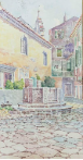
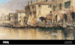
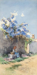
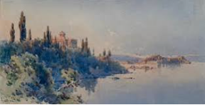
‘What landscape and seascape techniques were studied at Art Schools in Italy by the founders of the Ionian School of Art on Corfu?’

AI – ‘The founders and masters of the Ionian School of Art on Corfu—such as Panagiotis Doxaras, Charalambos Pachis, and master watercolorists Angelos Giallinas and Spyridon Skarvellis—extensively studied Western academic traditions in major Italian cities like Venice, Rome, and Naples. [1, 2, 3, 4, 5]By training at Italian fine arts academies, they abandoned flat, stylized Byzantine iconographic rules in favour of secular European techniques. They specifically imported several landscape and seascape techniques to capture the unique topography and light of the Ionian Islands: [1, 2]Core Landscape and Seascape Techniques

  • Linear and Aerial Perspective: Artists learned to map horizons with mathematical precision, creating three-dimensional depth across open sea expanses. They used atmospheric (aerial) perspective—softening colors and fading background details—to realistically depict distant landmasses, like the mountains across the Corfu strait. [1, 2]
  • Chiaroscuro and Tonal Gradation: Moving away from the flat lighting of religious icons, they adopted subtle progressions of light and shadow. This allowed them to sculpt the raw physical volume of rugged Corfiot cliffs, rolling hills, and coastal rock formations. [1]
  • Naturalistic Sea Rendering: Painters replaced stylized Byzantine waves with fluid, transparent layers. They learned to paint the shifting reflections, deep horizons, and translucent turquoise hues of the sea under active sunlight. [1]
  • En Plein Air and Gouache/Watercolor Precision: Ionian artists adopted Italian practices of outdoor oil sketching and fluid watercolor precision to quickly capture the transient, luminous quality of Mediterranean light hitting water and olive foliage. [1]
  • Integration of Classical Ruins: Mirroring Italian Neoclassicism, artists systematically embedded ancient temples, classical architecture, and Venetian ruins into natural vistas, using them as structural anchors to ground the landscape in historical narrative. [1]
  • Secularized Oil on Canvas: The transition from egg tempera on wood panels to oil paints on canvas allowed for smoother blending, richer color transitions, and a truer-to-life environmental palette (earthy ochres, soft blue-greens).

The history of the Ionian School of Art is anchored by two distinct eras: the 18th-century ideological shift led by pioneers like Panagiotis Doxaras, and the late 19th-century atmospheric mastery of watercolorists like Angelos Giallinas. [1, 2, 3, 4]These phases demonstrate how Italian academic styles evolved from structural studio theories into sweeping, open-air Mediterranean landscape painting. [1]


The Theoretical Pioneer: Panagiotis Doxaras (1662–1729)Panagiotis Doxaras was the theoretical father of Modern Greek art. He did not just paint; he actively dismantled the flat maniera greca (Byzantine iconographic tradition) and codified the transition into the realist stile Ionico. [1, 2, 3]

  • The Italian Manifestos: While studying in Italy, Doxaras meticulously translated pioneering Western art texts into Greek. In 1720, he translated Leonardo da Vinci’s Trattato della Pittura (On Painting). In 1724, he appended translations of texts by Leon Battista Alberti and Andrea Pozzo. [1, 2]
  • The Rules of Space: Through these texts, Doxaras taught Greek artists how to structure a landscape using mathematical linear perspective. He proved that the sky and distant landmasses were not arbitrary gold backdrops but continuous extensions of physical space governed by geometry. [1, 2, 3]
  • Material Shift: Doxaras pioneered the replacement of egg tempera on wooden panels with oil on canvas. This allowed his successors to layer transparent glazes, creating depth in clouds, rolling hills, and coastal horizons. [1, 2]
  • Chiaroscuro: He integrated the Italian technique of casting focused, directional light sources across subjects. This created physical volume and weight, paving the way for future artists to accurately sculpt cliffs and mountain ranges with shadow. [1, 2]

The Atmospheric Master: Angelos Giallinas (1857–1939)While Doxaras built the technical foundation, Angelos Giallinas took these rules out of the studio and into nature. Studying in Venice, Naples, and Rome during the 1870s, Giallinas bypassed heavy oil paints to dedicate his life entirely to the fluid medium of watercolor. [1, 2, 3, 4]

  • Suspended, Veiled Atmospheres: Giallinas became legendary across Europe for capturing the soft, luminous coastal mist of Corfu. He mastered the wet-on-wet technique, bleeding soft washes together to blend the sea seamlessly into the sky. [1, 2, 3]
  • The “Romance of Ruins”: Heavily influenced by Western European Neoclassicism, Giallinas frequently framed Corfu’s natural topography with classical structures, ancient temples, or local landmarks like Pontikonisi Island. These ruins acted as structural anchors within his sprawling, romanticized horizons. [1, 2]
  • Translucent Water and Light: Using the white of the paper instead of white paint, Giallinas mastered the representation of light reflecting off the Ionian Sea. His work caught the attention of British Ambassador Clare Ford and the British Royal Family, who commissioned vast albums of his Mediterranean landscapes. [1, 2, 3]
  • Spreading the Technique: In 1902, Giallinas founded a private art school on Corfu. This solidified watercolor painting as the definitive medium of late Ionian landscape art, influencing generations of local open-air artists. [1, 2]

Following Angelos Giallinas’s radical shift toward open-air landscape painting, his contemporaries Charalambos Pachis and Spyridon Skarvellis built directly upon these outdoor traditions. Rather than merely copying Giallinas’s atmospheric style, they expanded the scope of Ionian landscape art by introducing narrative realism, structural clarity, and broader regional light studies. [1, 2, 3, 4]They evolved the Ionian School’s plein air traditions through distinct approaches:Charalambos Pachis (1844–1891): Merging Landscape with Folk RealismWhile Giallinas often painted romanticized, unpopulated landscapes focused on ancient ruins, Charalambos Pachis brought a sense of human life, community, and social realism into the outdoors. [1]

  • The Populated Landscape: Pachis was one of the first Ionian painters to integrate genre scenes (daily life) into large-scale plein air settings. Instead of empty natural vistas, his outdoor backdrops host local Corfiots in traditional garments engaging in cultural activities—as seen in his famous work May Day on Corfu. [1, 2, 3, 4]
  • Sculpted Light and Form: Trained at San Luca in Rome, Pachis rejected hazy, bleeding color bleeds in favor of academic structural clarity. He utilized a realistic outdoor vocabulary where bright Mediterranean sunlight is sharply defined, ensuring that every coastal cliff, wave, and olive grove maintained a clean, mathematically clear form. [1, 2]
  • Institutionalizing Plein Air: In 1870, Pachis founded the first influential private school of painting on Corfu. Through this academy, he turned outdoor light study from a personal style choice into a standard, structured curriculum for the next generation of Corfiot painters. [1, 2]

Spyridon Skarvellis (1868–1942): Expanding the Atmospheric HorizonSpyridon Skarvellis was Giallinas’s true successor in the medium of pure watercolor. He took Giallinas’s soft, open-air techniques and pushed them toward a more poetic, emotionally expressive style while expanding the school’s geographical borders. [1, 2]

  • Poetic and Poignant Brushwork: Skarvellis departed from Giallinas’s hyper-detailed architectural focus. Instead, he utilized a sharp, visible brushstroke that gave his water and sky textures a more dynamic, active energy. His landscapes felt less like static postcard vistas and more like fleeting moments of shifting coastal weather. [1]
  • The “Orientalist” Light Shift: Skarvellis famously traveled beyond Greece to live and work in Egypt. By applying Ionian watercolor techniques to North African riverbanks and desert ruins, he adapted the school’s atmospheric perspective to master an entirely new variety of light—capturing the arid, intense, and dusty amber glows of the Nile, which he contrasted against Corfu’s humid, turquoise coastal mist. [1]
  • The Achilleion Collaboration: Skarvellis’s mastery of outdoor perspective earned him a commission to work on the fresco decorations of the Achilleion Palace (the summer palace of Empress Elisabeth of Austria). This project beautifully blended interior architecture with simulated, sprawling outdoor theatrical panoramas. [1]

The masters of the Ionian School of Art acquired their landscape and seascape techniques by training at specific Italian academies across Venice, Rome, and Naples. Rather than adhering to a single school, these artists traveled between different institutions to combine the structural precision of central Italian drafting with the fluid, light-centric traditions of the south. [1, 2]The definitive academic environments that shaped their work include:1. Accademia di San Luca (Rome)The Accademia di San Luca in Rome was the epicentre of classical, structural draftsmanship. It provided the bedrock for the school’s spatial arrangements. [1, 2, 3]

  • Who studied there: Charalambos Pachis (enrolled 1868–1869) and Spyridon Skarvellis completed major portions of their training here. Angelos Giallinas also refined his style in Rome. [1, 2, 3]
  • Techniques taught: The academy focused on disegno (drawing/design) and strict mathematical linear perspective. Students learned to compose deep, measured horizons and systematically calculate receding geometric planes. This enabled Ionian artists to place coastal ruins and architecture cleanly into vast landscape vistas. [1, 2]

2. Accademia di Belle Arti di Napoli / Istituto di Belle Arti (Naples)The Neapolitan academies exposed Ionian painters to the rich traditions of the School of Posillipo and the Vedutisti (landscape view-painters), who prioritized dramatic coastal lighting and atmospheric rendering. [1]

  • Who studied there: Charalambos Pachis and Angelos Giallinas (who attended the Istituto di Belle Arti in 1878).
  • Techniques taught: Naples was essential for naturalistic seascape rendering. Here, artists learned chiaroscuro and tonal gradation to model the harsh light hitting rugged cliffs. They studied the manipulation of fluid transparency to render the moving surface and translucent turquoise tones of the sea under intense Mediterranean sunlight. [1, 2, 3]

3. Accademia di Belle Arti di Venezia (Venice)Given Corfu’s historic Venetian ties, Venice was a natural training ground. It taught Ionian artists how to capture the interaction between humid air, water, and soft ambient light. [1]

  • Who studied there: Angelos Giallinas formally trained at the Venice Academy from 1875 to 1877. Centuries prior, pioneer Panagiotis Doxaras studied in Venice under master Leos Moskos, absorbing the lavish color philosophies of Titian and Tintoretto. [1, 2, 3]
  • Techniques taught: The Venetian tradition focused on colorito (the mastery of color and light over rigid line). Giallinas and Doxaras absorbed aerial (atmospheric) perspective, learning how moisture-rich air softens distant background details. This directly translated into the bleeding, wet-on-wet watercolor horizons used to depict the Corfu strait. [1, 2]

4. Specialized Training in Trieste

  • Who studied there: Spyridon Skarvellis initiated his advanced Italian training in the northern port city of Trieste before moving on to Rome. Trieste’s unique coastal geography and artistic circles served as an ideal bridge for mastering the interplay of northern Adriatic light and academic maritime drawing. [1, 2]

Comparative Academy Specialisations

AcademyPrimary Regional InfluenceCore Landscape/Seascape Technique Passed On
Accademia di San Luca (Rome)Classical Academic RealismMathematical linear perspective & architectural framing
Accademia di NapoliVedutismo (View Painting) & Posillipo SchoolChiaroscuro, translucent sea tones, and cliff volumes
Accademia di VeneziaVenetian Renaissance & BaroqueAerial perspective and luminous, bleeding color blending.’

‘How did artists of the Ionian School on Corfu apply and express classical Greek and roman aesthetics in landscapes & seascapes?

AI – ‘Artists of the Ionian School (or Heptanese School) on Corfu applied and expressed classical Greek and Roman aesthetics in landscapes and seascapes by blending Western European Neoclassicism, Renaissance perspective, and Italianate naturalism with the physical ruins and mythological layout of the island. [1, 2, 3]

Because the Ionian Islands never fell under Ottoman rule and remained under Venetian, French, and British control, their artists bypassed traditional Byzantine restrictions and engaged directly with Western classical revivals. They expressed these aesthetics through specific techniques and themes: [1, 2]

1. Geometric Perspective and Harmonious Order

Classical Greco-Roman aesthetics demand balance, symmetry, and structural harmony. Ionian school pioneer Panagiotis Doxaras actively championed transitioning away from flat Byzantine styles toward Western rules of three-dimensional depth. In landscapes and seascapes, artists mapped the rugged terrain of Corfu using: [1, 2]

  • Linear perspective: Framing coastal lines and vast seascapes with strict mathematical depth.
  • Atmospheric perspective: Softening distant details (like the Albanian mountains across the strait) to mimic the balanced, ordered approach to nature seen in Italian Renaissance works. [1]

2. The Integration of Classical Antiquity and Ruins

Artists systematically integrated classical architecture and ancient ruins into the natural topography. This technique directly mirrored Western European Neoclassicism and the “Romance of Ruins” trend. [1, 2]

  • Master watercolorists like Angelos Giallinas and Spyridon Skarvellis painted sweeping panoramas of Corfu’s coasts that prominently featured classical monuments, ancient temples, or neoclassical estates. [1, 3]
  • The ancient architectures were not just backdrops; they served as visual anchors to anchor the landscape in the grand historical narrative of Antiquity. [1]

3. Mythological Allegory and Idealized Nature

Rather than painting raw, unmanipulated nature, Ionian artists often romanticized landscapes to reflect classical mythology.

  • Areas like the Garitsa Shipyards or the cliffs of Palaiokastritsa were deliberately painted to evoke Homer’s Odyssey—framing Corfu as the mythical island of Scheria (the Kingdom of the Phaeacians). [1, 2]
  • Landscapes were depicted as idyllic, pastoral spaces (reminiscent of Virgil’s Roman Arcadia) where nature appeared perfectly balanced, serene, and untouched by industrial chaos.

4. Mathematical Study of Light and Clarity

Greco-Roman art heavily values clarity of form. Ionian artists achieved this by shifting toward plein air watercolor painting and detailed light studies. [1, 2]

  • Painters like Charalambos Pachis and Spyridon Pizanis utilized a realistic vocabulary focused entirely on how Mediterranean light reflects off the sea and illuminates coastal stone. [, 2]
  • They avoided muddy or chaotic colors, ensuring that every wave, cliff face, and olive grove maintained a clean, sculpted clarity that reflected classical ideals of beauty and form.’

‘The City of Gotha Public Policy Exception to a Foreign Statute of Limitation.’

In City of Gotha and the Federal Republic of Germany v Sotheby’s and Cobert Finance SA, unreported case no 1997/G/185, 9 September, QBD, Mr Justice Moses applied a specific multi-step private international law analysis. He used Section 2 of the Foreign Limitation Periods Act 1984 to refuse enforcement of the German statute of limitations.

The judge systematically dismantled the defendant’s limitation defence through the following mechanisms:

1. Triggering the Foreign Limitation Periods Act 1984

Under English choice-of-law rules, the validity of a property transfer is governed by the law of the place where the transfer occurred (lex situs). Because the 17th-century painting was stolen from Germany, German law was determined to be the governing substantive law.

Historically, English courts viewed limitation periods as “procedural” and ignored foreign timelines. However, the Foreign Limitation Periods Act 1984 altered this rule: it mandates that if a foreign law governs the substance of a dispute, that foreign country’s limitation periods must also apply in the English court.

2. Identifying the “Offending” German Rule

The defendants (Cobert Finance) argued that even if the painting was originally stolen, the true owners’ claim was dead. Under Section 221 of the German Civil Code (Bürgerliches Gesetzbuch or BGB), proprietary claims to recover chattels face an absolute 30-year limitation period. Crucially, German law applied this 30-year bar even if the property was stolen and even if subsequent possessors acted in bad faith. Because more than 30 years had elapsed since the 1945 theft, German law would completely defeat Gotha’s claim.

3. Activating the Section 2 Public Policy Discretion

The Foreign Limitation Periods Act 1984 contains a safety valve. Under Section 2(1), an English court can refuse to apply a foreign limitation law if doing so would “conflict with public policy”.

Mr Justice Moses invoked this exact exception by assessing English public policy alongside statutory frameworks: [, 2]

  • The English Benchmark: He looked at Section 4 of the Limitation Act 1980, which explicitly states that time does not run in favour of a thief or anyone who purchases stolen property in bad faith.
  • The Public Policy Conflict: The judge declared that there is a fundamental principle in English public policy protecting property owners against theft. He ruled that enforcing a foreign statute of limitations that rewards a thief or a bad-faith handler by extinguishing the original owner’s right to sue is wholly contrary to English public policy.

4. The Judgment’s Outcome

By successfully blocking the 30-year German limitation period, Mr Justice Moses removed the statutory bar that would have defeated the claim. The court reverted to standard equitable remedies. Since the defendants could not prove a legitimate, good-faith root of title, the English High Court ordered that the painting be returned to the City of Gotha and the German government.

The principle applied in City of Gotha was restricted strictly to the exceptional facts of the case and does not have a wide or generalized application.

In English private international law, the public policy exception is famously treated as a “narrow escape route”. Mr Justice Moses himself explicitly warned in his judgment that public policy should be invoked only in exceptional circumstances and with the greatest circumspection. [1, 2]

The decision was highly restricted to its specific context due to several legal boundaries:

1. High Threshold of “Undue Hardship”

The English courts cannot reject a foreign limitation period simply because it is different from English law, or because it seems harsh. Under the Foreign Limitation Periods Act 1984, a foreign statute can only be struck down if its application would shock the English conscience or cause “undue hardship”. The exception is a shield for gross injustice, not a tool to bypass foreign law routinely.

2. Confined to the Unique Context of Stolen Art

The judge’s ruling was inextricably tied to the international and historical context of looted cultural property. The specific “shock” to English public policy was the concept that a thief, or a person acquiring property from a thief in bad faith, could legally obtain unassailable title to a priceless historic masterpiece simply by waiting out a clock.

3. Contrast with Ordinary Commercial Disputes

If the case had involved an ordinary commercial breach of contract, a standard debt collection, or a normal tort claim, the English court would not have intervened. For example: [1]

  • If German law dictated a very short limitation period (e.g., 3 years) for a commercial claim that would completely bar an English plaintiff from suing, English courts would routinely enforce it.
  • English public policy values comity (respecting foreign legal systems) and legal certainty. It will generally defer to a foreign state’s statutory windows, even if they disadvantage one party.

Summary

The City of Gotha principle is a narrow precedent. It establishes that English courts will deploy public policy to block foreign limitations only when the foreign rule actively rewards gross bad faith or criminal theft—particularly in high-profile art and cultural restitution claims. It does not give claimants a wide license to escape restrictive foreign statutes of limitation in everyday cross-border litigation.

Yes, the principle can certainly be invoked and applied in a future art restitution claim under those exact conditions. If a foreign rule actively rewards gross bad faith, a criminal thief, or a bad-faith handler by blocking the true owner’s recovery, an English court is highly likely to deploy the City of Gotha precedent to strike it down.

However, the bar for doing so remains exceptionally high. To successfully invoke this principle in a future dispute, the claim must satisfy a strict set of legal criteria:

1. It Must Involve Proven Bad Faith or Theft

The English public policy exception cannot be used simply because a foreign limitation period is shorter or harsher than English law. [1, 2]

  • When it CAN be applied: If the foreign rule deliberately cuts off the owner’s title even when the current possessor knew the art was stolen, or if it allows a thief to legally profit from the crime. This directly violates the bedrock English principle that “time does not run in favour of a thief”.
  • When it CANNOT be applied: If a piece of art was bought by an innocent, good-faith purchaser who did rigorous provenance checks, and a foreign law protects that good-faith buyer after a set period, the English court will generally respect the foreign law. Public policy will not be invoked just to help a claimant bypass a standard, fair statute of limitations.

2. Alignment with International Conventions

A future application of this principle would be heavily reinforced by modern international public policy regarding cultural property. English courts look at prevailing global standards, such as the 1995 UNIDROIT Convention on Stolen or Illegally Exported Cultural Objects, which explicitly demand the return of stolen cultural items. A foreign law that protects thieves runs completely counter to these international commitments, making a public policy intervention highly justifiable.

3. Evidentiary Hurdles

The biggest obstacle to applying this principle in a future case is not the law itself, but the evidence. To prove “gross bad faith” decades after a theft occurred, a claimant must provide watertight documentation showing that the current possessor (or their immediate predecessor) knew or willfully ignored the fact that the artwork was stolen.

Summary

The City of Gotha principle remains a living weapon in the arsenal of art restitution lawyers, but it is a precision instrument. It can be applied in the future, but only if a claimant can prove that the foreign law creates an unconscionable result by actively shielding criminal behavior or deliberate dishonesty from legal consequences.

In City of Gotha v Sotheby’s, English jurisdiction was established primarily because the stolen painting was physically located in London and the legal wrongs occurred within England.

Under English private international law, the court does not look for a broad geopolitical connection to a dispute to claim jurisdiction; it relies on where the defendants are served with the lawsuit and where the disputed property is located.

Jurisdiction over each defendant was established through standard procedural avenues:

1. Jurisdiction over Sotheby’s (First Defendant)

  • The Location of the Asset: The Wtewael painting was discovered and securely held by Sotheby’s auction house at its headquarters in London, where it had been sent to be auctioned.
  • Presence in the Jurisdiction: Because Sotheby’s is an English company with its registered office in London, it was physically and legally present within the jurisdiction. Serving them with the writ (the legal claim) automatically triggered the English court’s jurisdiction over them.

2. Jurisdiction over Cobert Finance S.A. (Second Defendant)

  • The Tort of Wrongful Interference: Cobert Finance was a Panamanian corporate vehicle used by a private individual to claim ownership of the painting. Even though it was a foreign company, the legal claim brought against it by the City of Gotha was for the tort of wrongful interference with goods (conversion/detinue).
  • The Location of the Wrong: Because Cobert Finance was actively asserting ownership over a piece of property that was sitting inside England, the alleged “wrongful interference” and the resulting damage to the rightful owners were happening within English territory. Under English civil procedure rules, a plaintiff can serve a foreign defendant outside the country if the tort or the damage occurred within England.

3. Submission to the Jurisdiction

Furthermore, rather than successfully fighting a jurisdictional battle to have the case thrown out or moved to a different country, the defendants entered the proceedings to fight the case on its merits. By actively defending the claim and asserting their own superior title to the painting in the High Court, Cobert Finance submitted to the jurisdiction of the English court.

Summary

The English court had jurisdiction not because the theft happened there (it happened in Germany), but because the painting was physically in London, the auction ho The legal basis for the claim in City of Gotha v Sotheby’s was a restitutionary proprietary claim deriving from superior ownership, coupled with the English tort of wrongful interference with goods (conversion).

The plaintiffs—the City of Gotha and the Federal Republic of Germany—sought the return of the stolen Joachim Wtewael painting through specific legal mechanisms:

1. The Tort of Conversion (Wrongful Interference)

Under English law, the plaintiffs argued that the second defendant, Cobert Finance S.A. (the Panamanian company claiming ownership), had committed the tort of conversion. They asserted that Cobert had wrongfully interfered with their property by:

  • Taking constructive delivery of the painting in 1989.
  • Consigning it to Sotheby’s for sale in London.
  • Attempting to sell it back to the City of Gotha in 1991.
  • Demanding its physical return from Sotheby’s in 1993. [1]

2. Legal Remedies Demanded

Based on this wrongful interference, the plaintiffs requested three primary remedies from the High Court: [1]

  • Declaratory Relief: A formal court declaration stating that the German state/City of Gotha held the true legal title to the painting.
  • An Order for Delivery Up: A mandatory court order forcing Sotheby’s or Cobert Finance to physically hand the artwork over to them.
  • Damages: Financial compensation as an alternative or supplement if the painting could not be recovered intact.

3. Dual Choice of Law Basis

While the lawsuit was framed as an English tort, Mr Justice Moses noted that the foundation of the claim was a restitutionary proprietary right. This required a dual legal approach:

  • German Law was used to establish the root of title (proving that the painting originally belonged to the Gotha museum and was illegally plundered by Soviet forces in 1946).
  • English Law governed the remedies and possessory rights because the painting was currently located on English soil.

use holding it was English, and the legal dispute over who owned it was playing out on English soil.

The competing ownership claims between the City of Gotha and the Federal Republic of Germany (FRG) were not a hostile battle between the two plaintiffs. Instead, they were resolved through a cooperative legal alliance and the application of unified German property law, which ultimately recognized the FRG as holding the legal title for the benefit of the city.

The court resolved the internal dispute between the two sovereign co-plaintiffs through the following mechanisms:

1. The Common Goal and Consolidated Action

Rather than fighting each other, the City of Gotha and the Federal Republic of Germany acted as co-plaintiffs in a consolidated lawsuit. Their primary objective was to present a united front against the common adversary: the Panamanian holding company, Cobert Finance S.A., which held the stolen painting.

2. Application of German State Succession Law

Because the 17th-century painting by Joachim Wtewael was originally stolen from a museum in Gotha (which sat in the former East Germany/GDR) by Soviet forces in 1946, Mr Justice Moses had to apply German law to determine which entity legally succeeded to the property after German reunification in 1990.

  • Under the German Unification Treaty (Einigungsvertrag) and related domestic restitution statutes, the Federal Republic of Germany (the federal state) is recognized as the legal successor to certain categories of state and cultural property formerly held within the GDR territory.
  • Therefore, applying German substantive law, the English High Court formally declared that the Federal Republic of Germany held the primary legal title to the painting.

3. The Ultimate Resolution: Return to Gotha

While the formal title was vested in the Federal Republic of Germany, the legal framework mandated that the federal government recovery was done on behalf of the local heritage from which it was taken.

  • The court’s order for the delivery of the painting essentially fulfilled the wishes of both plaintiffs.
  • Once the English court ordered the painting to be surrendered, the Federal Republic of Germany ensured that the masterpiece was physically returned to its historical home in the City of Gotha, where it was placed back on public display.

‘The Parisian avant-garde.’

AI – ‘The Parisian avant-garde was a radical network of 19th- and 20th-century artists who rejected traditional academic art rules to invent modern styles. French Impressionism was a core avant-garde movement starting in the 1860s—featuring painters like Claude Monet and Pierre-Auguste Renoir—that used loose brushwork and outdoor settings to capture fleeting light and modern life. [1, 2, 3, 4, 5]

The Parisian Avant-Garde

  • Definition: “Avant-garde” means being at the cutting edge. In Paris, it described creators who broke completely from the state-run Académie des Beaux-Arts. [1, 2, 3]
  • Rejection of Rules: They stopped painting historical, mythological, or biblical scenes. [1]
  • New Spaces: Artists banded together to fund their own independent group shows, bypassing official salon gatekeepers. [1, 2]
  • Evolution: The avant-garde umbrella spanned multiple eras, starting with Realism and Impressionism, and later shifting into Post-Impressionism, Cubism, and the School of Paris. [1, 2, 3, 4]

French Impressionism

  • Core Style: Artists traded smooth, blended studio finishes for rapid, visible brushstrokes and bright, unblended colors.
  • Plein Air Painting: Portable paint tubes allowed artists to leave indoor studios and paint en plein air (outdoors).
  • Modern Subject Matter: Instead of grand historical narratives, they painted urban streets, railway stations, cafes, and countryside leisure.
  • Key Figures: Claude Monet, Edgar Degas, Camille Pissarro, Berthe Morisot, and Pierre-Auguste Renoir. [1, 2, 3, 4, 5]

The transition from Impressionism to Post-Impressionism happened because younger artists felt that capturing fleeting light was not enough. They kept the bright colors of Impressionism but rejected its lack of structure and emotional depth. [1, 2, 3]

This transition split into two distinct paths: Paul Cézanne chose intellectual structure, while Vincent van Gogh chose emotional expression. [1]

The Big Shift: Why Change?

  • Beyond a Single Moment: Impressionists painted a quick glimpse of a scene. Post-Impressionists wanted to paint things that felt permanent, deep, or symbolic. [1, 2, 3, 4, 5]
  • Not a Single Club: Unlike the original Impressionists who held group shows, the Post-Impressionists worked alone and had wildly different styles. [1, 2]
  • Leaving Paris: Artists left the busy city to find inspiration in the countryside or foreign lands. [1, 2]

🏛️ Paul Cézanne: The Search for Structure

Paul Cézanne believed Impressionist paintings were too soft and lacked form. He famously wanted to make Impressionism “solid and durable, like the art of the museums“. [1, 2]

  • Geometric Forms: He looked at nature and simplified it into basic shapes: cylinders, spheres, and cones.
  • Constructed Brushstrokes: He used blocky, parallel brushstrokes to paint solid objects like rocks, trees, and apples.
  • The Father of Modern Art: By breaking objects down into shapes and painting them from multiple angles at once, he directly inspired Cubism and artists like Pablo Picasso. [1, 2, 3, 4, 5]

🌻 Vincent van Gogh: The Outburst of Emotion

Vincent van Gogh used the bright palette he discovered from the Impressionists in Paris, but he did not care about painting things exactly as they looked. [1, 2]

  • Emotional Color: He used bold, unrealistic colors to show his inner feelings instead of real life—like painting a sky bright yellow or a chair deep blue to show loneliness or joy. [1, 2]
  • Swirling Lines: He turned short Impressionist brushstrokes into thick, swirling, rhythmic lines that made the canvas look alive with energy. [1, 2, 3]
  • The Father of Expressionism: His raw, honest style opened the door for Expressionism, showing that art is a window to the artist’s soul. [1, 2, 3, 4, 5]

Summary of Differences

Feature Impressionism Post-Impressionism (Cézanne) Post-Impressionism (Van Gogh)
Main Goal Capture fleeting light and sight Rebuild order and geometric shape Express intense personal feelings
Brushwork Loose, quick, sketchy strokes Deliberate, blocky, structured strokes Thick, swirling, high-energy strokes
Color Realistic colors of nature Colors used to create weight and depth Exaggerated, symbolic colors

The Metropolitan Museum of Art and the Van Gogh Museum hold incredible collections that show this historic artistic shift firsthand. [1, 2]’

‘What Aesthetic response/Aesthetic experience is stimulated by looking at landscapes and seascapes of the Ionian School?’


AI – ‘The technical academic term for the emotional and cognitive reaction a viewer has to a work of art is an aesthetic response or aesthetic experience, rooted in the concept of aesthetic empathy (Einfühlung). [1, 2, 3]

Key Academic Concepts

  • Aesthetic Response: The overall cognitive, emotional, and physiological reaction triggered in a viewer when perceiving art. [1, 2, 3, 4, 5]
  • Aesthetic Empathy (Einfühlung): Originating from 19th-century German aesthetics, it describes how a viewer projects their own feelings, bodily sensations, and thoughts into the forms and objects of a work. [1]
  • Emotional Contagion: A specific mechanism where the viewer unconsciously absorbs and mirrors the internal emotional tone or mood set by the artwork’s colors and composition. [1, 2]

The aesthetic response stimulated by the landscapes and seascapes of the Ionian School of Art (also referred to as the Heptanese School), particularly masters of the Corfu watercolor tradition like Angelos Giallinas, is best defined as a poetic-romantic contemplation of the picturesque blended with topographical empathy. [1, 2, 3]

Core Aesthetic Dimensions of Ionian Landscapes

  • Poetic Classicism-Romanticism: The synthesis of strict compositional balance (derived from Italian/Venetian academic training) with the atmospheric, luminous light of the Mediterranean evokes a tranquil, harmonious emotional resonance rather than the raw terror of the sublime. [1]
  • Chromatic Nuance and Luminosity: Master painters utilized transparent watercolor washes or soft oil glazes to capture the distinct turquoise and azure hues of the Ionian Sea, stimulating a serene, meditative cognitive response in the viewer. [1, 2]
  • Sense of Place (Topophilia): By faithfully rendering local landmarks like the Old Fortress of Corfu or the cypress-studded islet of Pontikonisi, these works trigger an emotional connection to historical landscape and Mediterranean light. [1, 2, 3, 4, 5]

The paintings of the Ionian School evoke an aesthetic response through a precise technical interplay of optical realism, atmospheric transparency, and cultural-topographical familiarity.

Formal and Technical Drivers

  • Luminous Tonal Gradation: Artists manipulate value scales and soft transitions of light (chiaroscuro softened by Mediterranean brightness) to mimic how sunlight actually hits moisture in the Ionian air, tricking the eye into a physiological sense of warmth and space. [1]
  • Layered Transparency: Using fluid watercolor washes or thin oil glazes allows light to pass through the pigment and reflect off the white paper or ground layer underneath, producing an inner radiance that registers cognitively as serene and uplifting. [1, 2]
  • Balanced Compositional Geometry: Rooted in Heptanese-Italian academic structures, the horizon lines and architectural placements stabilize the viewer’s eye, substituting visual chaos with a subconscious sense of equilibrium and calm.
  • Aesthetic Anchoring (Topophilia): By embedding recognizable regional details—such as local flora or historic Corfiot masonry—the work activates personal or cultural memory, turning abstract shapes into a deeply felt place attachment.

The illusion of atmospheric depth in Mediterranean landscapes relies on how light travels through a medium before reaching the viewer’s eye. Watercolour layering (washes) and oil glazes achieve this depth through opposite optical paths, utilizing the white ground of the paper versus suspended translucent pigment layers in oil. [1, 2]

Optical Mechanism and Light Reflection

  • Watercolour Layering: Light travels all the way through the transparent washes of pigment, hits the highly reflective white paper substrate, and bounces back directly through the layers to the viewer’s eye. Depth is created subtractively by letting more of the original paper luminance show through in the distance (atmospheric perspective) while building density in the foreground. [1, 2, 3, 4, 5]
  • Oil Glazes: Light penetrates a thin, transparent film of oil-and-pigment suspension, reflects off an opaque lower paint layer (often a light imprimatura or underpainting), and refracts back. Depth is achieved by trapping light within the refractive index of the oil and resin vehicle itself, creating a rich, dense optical chamber. [1, 2, 3, 4, 5]

Handling of Edges, Transitions, and Atmosphere

  • Watercolour Layering: Relies on precision timing (working wet-on-dry for hard architectural edges or wet-on-wet for soft, misty atmospheric horizons). Edges can be delicate or crisp, but corrections are difficult; mistakes require lifting or scrubbing. The resulting atmosphere feels immediate, airy, and light-filled. [1, 2, 3, 4, 5]
  • Oil Glazes: Allows infinite manipulation time because oil dries slowly. Artists can soften transitions by feathering or wiping away wet glaze with a clean brush to reveal warmer undertones beneath. This results in a seamless, smoky (sfumato) transition ideal for heavy, humid maritime air or deep twilight shadows. [1, 2, 3, 4, 5]

The magical, shimmering atmosphere of Ionian School landscapes hinges on how transparent pigments interact with light, paired with master techniques for capturing intense Mediterranean sun glare.


Pigment Transparency and Optical Depth

To create a “suspended, veiled atmosphere,” masters like Angelos Giallinas meticulously balanced pigments based on their inherent mineral or chemical transparency. [1, 2]

The chart below details how different pigment categories are used to construct spatial layers in watercolor:

Transparency Class Typical Landscape Pigments Use in Ionian Landscapes & Seascapes Optical Effect
Transparent Ultramarine Blue, Aureolin, Rose Madder Distant maritime horizons, open skies, and initial glowing ambient washes. Light passes completely through to the paper and bounces back, creating pure, radiant color depth.
Semi-Transparent Cobalt Blue, Raw Sienna, Viridian Mid-ground foliage, shifting sea currents, and soft shadows on Corfiot masonry. Partially diffuses the light, introducing a gentle atmospheric haze or humidity to the air.
Semi-Opaque Burnt Umber, Yellow Ochre Immediate foreground topography, historic stone ruins, and dense olive groves. Halts some light penetration, anchoring the viewer’s eye with solid, structural elements.
Opaque Cadmium Red, Cerulean Blue, Indian Red Highlights on costume figures or precise tectonic accents. Blocks the paper entirely, bringing these elements forward dynamically.

Paper Preservation: The Master Technique of Angelos Giallinas

The absolute golden rule of classical watercolor is that true white paint (like Chinese White gouache) is rarely used for highlights. Opaque white paint sits on top of the paper, scattering light and appearing chalky or dead. Instead, Giallinas and his contemporaries relied on paper preservation (also known as negative painting or reserving the white). [1, 2, 3, 4, 5]

[ viewer’s eye ]  <============= (Pure, intense bounce-back)

       ||

[ untouched paper ]  <=========== (Absolute white substrate)

Giallinas executed this with virtuosic precision to capture the blistering Greek sun:

  • The White Substrate as Light Source: By leaving the high-quality white paper completely untouched by pigment, the raw substrate acts as the brightest light source in the painting. [1]
  • Controlling the Edge: Giallinas would wash large, fluid strokes of transparent Ultramarine or Cobalt blue for the Ionian sky, carefully steering his brush around the shapes of coastal rocks, sailboat sails, or the stone walls of the Old Fortress. [1]
  • The Iridescent Glare: Because the raw paper reflects 100% of the ambient light, these reserved white shapes vibrate intensely against the surrounding cool washes. This simulates the physical phenomenon of a “sun flare” or water reflection, triggering a realistic psychological perception of intense, blinding heat and coastal moisture. [1, 2]

The pristine, unpainted highlights in 19th-century Ionian landscapes rely heavily on the physical materials used. The crisp architectural lines of Corfu’s fortresses and the blinding glare of the Mediterranean sun require a delicate balance between historical paper engineering and strategic under-drawing composition.


1. The Chemistry of 19th-Century Papers: Achieving the “Reserved Edge”

During the 1800s, British and European paper mills—such as J Whatman and Fabriano—perfected 100% cotton and linen rag papers. The choice of texture fundamentally dictated how sharply an artist could paint around a reserved highlight. [1, 2, 3]

  • Hot-Press (HP) Paper (The Smooth Edge): Passed through heated metal rollers during manufacturing, this paper has an exceptionally slick, flat finish. Artists used it for fine architectural lines, rigging on Ionian ships, or sharp masonry edges. Because it has virtually no surface texture (“tooth”), the brush travels without friction. Water sits on the surface longer instead of instantly sinking in. This gave painters maximum time to guide a dark wash right up to the boundary of a reserved white area, creating an immaculate, sharp, razor-crisp edge. [1, 2, 3, 4, 5]
  • Cold-Press (NOT) and Rough Papers (The Shimmering Edge): Pressed with cold rollers or coarse felt blankets, these papers possess a textured, pitted surface. When a watercolorist sweeps a damp brush quickly across it (the dry brush technique), pigment skips over the physical valleys of the paper. The peaks catch the color, while the microscopic pockets remain completely white. This texture creates a fractured, sparkling reserved edge, effectively mimicking the blinding glimmer of sunlight dancing across the Ionian Sea. [1, 2, 3, 5]
  • Sizing (The Defensive Barrier): Historical papers were heavily sized inside and out with animal gelatin. This sizing acted as a barrier, preventing wet pigment from bleeding or spreading into the areas meant to be kept pure white. [1, 2, 3, 4, 5]

2. Under-Drawing Structure: How Angelos Giallinas Mapped His Vision

Because watercolor is transparent and unforgiving, Angelos Giallinas could not simply paint spontaneously; he had to map his landscapes like an architect before wetting his brush. [1, 2]

[ Light Pencil Framework ] ──> [ Masking/Reserving Whites ] ──> [ Ambient Underwashes ]

  • The Graphite Skeleton: Giallinas began with a highly detailed, light under-drawing using a hard graphite pencil (such as a 2H or 4H). He carefully traced the silhouettes of Corfiot architecture, olive branches, and the hulls of coastal boats. Crucially, he did not just draw the objects; he lightly outlined the shapes of the shadows and the highlights themselves. [1, 2, 3]
  • Mapping the Whites: The pencil lines served as strict psychological “no-fly zones.” When applying his fluid ambient washes—often a warm base of Raw Sienna or a cool wash of Ultramarine—he used the graphite layout to visually navigate his brush around the white sails or sunlit stones. [1]
  • The Ghostly Under-Drawing: Because watercolor washes are transparent, the pencil lines often remain visible beneath the paint layers if you look closely at his original works. Rather than distracting the viewer, these structural graphite lines help anchor the soft, floating watercolor washes, giving his dreamlike, veiled Mediterranean atmospheres a firm sense of tectonic reality. [1, 2]

To render the sun-baked, luminous architectural shadows characteristic of the Ionian School, masters like Angelos Giallinas utilized a subtle complementary earth-and-sky mix rather than flat black, while 19th-century watercolorists turned to sgraffito (scraping back) to manually pull brilliant highlights out of dry paper. [1]

Giallinas’s Pigment Palette for Architectural Shadows

  • Cobalt Blue or Ultramarine Blue: Mixed as the cool ambient base to reflect the ambient Mediterranean sky light bouncing onto stone walls.
  • Raw Sienna or Burnt Umber: Blended in deliberate, transparent opposition to the blue, introducing a warm, earthy undertone that mimics weathered limestone and stucco.
  • Neutral Tint or Payne’s Grey: Used sparingly in deep crevices, combined with a touch of Venetian Red or Light Red ochre to keep shadows luminous and warm rather than dead or slate-cold.

Manual Scraping (Sgraffito) for Dried Highlights

When artists needed a sharp, sparkling highlight after a wash had completely dried, they employed a destructive yet precise mechanical recovery: [1, 2]

  • The Tool Choice: Traditional painters used a scalpel, a penknife, or a dedicated X-Acto knife to interact with the dry surface. [1, 2]
  • The Physical Action: The blade is held at a shallow angle and lightly dragged or shaved across the dried paint layer. This shears away the topmost pigmented paper fibers down to the clean white subsurface underneath. [1, 2, 3]
  • The Risk & Reward: Because 19th-century cotton rag paper had strong internal sizing, a light scrape exposed clean white fibers that could catch a subsequent faint glaze, but heavy scraping permanently destroyed the paper’s “tooth,” causing later washes to bleed into the furrow

Reapplying gum arabic to scraped watercolor paper restores the protective gelatin sizing and seals the rough fibers so that final dark details don’t bleed or sink into the paper. [1]

The Repair Process

  • Surface Cleaning: Gently brush away any loose paper dust or fine cellulose shavings left behind by the knife or scalpel.
  • Diluting the Gum: Mix liquid gum arabic binder with clean water in a 1:3 or 1:4 ratio to create a fluid, non-sticky solution. Pure gum arabic is far too thick and will dry into a glossy, brittle plastic film that cracks. [1]
  • Precise Reapplication: Dip a fine-point sable brush into the diluted mixture and dab or feather it strictly over the scraped, damaged white mark.
  • Drying and Sealing: Let the area dry completely for 15 to 30 minutes. The gum sinks into the exposed paper threads and hardens them, recreating the non-absorbent “surface tension” of the original paper. [1, 2]
  • Painting the Final Detail: Apply your final crisp brushstroke (such as a dark architectural shadow line or rigging) directly over the sealed repair; the pigment will sit cleanly on top instead of feathering into a fuzzy halo.

To prevent paper from warping under heavy washes, you must expand the cellulose fibers fully through controlled saturation before locking them down. For an antique aesthetic, historic staining alters the base tone from clinical white to a warm, sun-bleached parchment. [1, 2, 3]

Professional Paper Stretching Method

  1. Dampen the Sheet: Immerse your cotton watercolor paper in clean, cool water for 3 to 5 minutes until it feels completely limp and relaxed. [1]
  2. Drain Excess Moisture: Lift the paper and let the water drip off, then lay it flat on a waterproof rigid board (such as marine plywood or Gatorfoam). [1]
  3. Smooth and Secure: Wipe the surface gently from the center outward with a clean, damp sponge to push out air pockets. [1, 2]
  4. Apply Gummed Tape: Wet the adhesive side of water-activated brown gummed craft paper tape and press it firmly down along all four edges, overlapping half onto the wet paper and half onto the board. [1, 2]
  5. Dry Naturally: Leave the board flat in a horizontal position for 12 to 24 hours away from direct heat sources. As the paper dries, it contracts against the tape, pulling taut into a drum-like, buckle-free surface ready for heavy washes. [1, 2, 3, 4]

Staining and Tinting Techniques for Aged Effects

  • Tannin Washes (Tea or Coffee): Brew a strong batch of black tea or instant coffee and pour it into a shallow tray. Submerge the paper completely for 2 to 3 minutes for a uniform mellow yellow-brown tint, or brush it selectively around the edges to mimic foxing and age. Adding a pinch of baking soda to the tea neutralizes acidity and deepens the warm caramel tone. [1, 2, 3, 4, 5]
  • Walnut Ink Tinting: Use diluted walnut crystal ink or traditional sepia washes applied with a broad mop brush. This deposits rich, light-fast organic pigments that mimic historical vellum without the high acidity breakdown caused by basic food infusions. [1, 2]
  • Textural Granulation: While a tea or coffee wash is still wet on the page, drop coarse coffee grounds or sprinkle loose crystal salt onto targeted zones. The grains push pigment aside and concentrate tannins in organic, irregular blotches that simulate centuries of environmental wear.

To re-size aged or degraded paper so it can properly accept transparent watercolor washes without over-absorbing pigment, you must create an external gelatin barrier that seals the porous cellulose fibers. When historical or antique paper loses its original sizing, it acts like a sponge, causing wet washes to sink instantly, look muddy, and lose color brilliance. [1, 2, 3, 4]

The Gelatin Re-Sizing Formula and Method

  1. Mix the Solution: Dissolve 7 to 10 grams (about one unflavored 0.25 oz packet) of technical or culinary unflavored gelatin into 1 quart (1 liter) of cool water. Allow the granules to swell for 10 to 15 minutes. [1, 3, 4]
  2. Warm Gently: Heat the mixture slowly until the gelatin completely liquefies, ensuring the temperature never exceeds 140°F (60°C), as boiling breaks down the protein chains. Keep the working solution warm at around 104°F (40°C). []
  3. Apply with a Soft Mop Brush: Lay your aged paper flat on a clean, waterproof surface. Using a large, soft-haired hake or wash brush, apply the warm gelatin solution swiftly in one horizontal direction. [1]
  4. Cross-Coat for Uniformity: Immediately apply a second light coat in a perpendicular (vertical) direction before the first pass sets, ensuring even coverage without scrubbing up loose paper fibers. [1, 2]
  5. Cure and Dry: Blot any pooled excess from the corners with a clean sponge and let the sheet dry completely flat for 12 to 24 hours at room temperature. Once fully cured, the gelatin locks onto the surface, allowing transparent washes to sit brilliantly on top and giving you ample time to blend and lift color. [, 2, 3, 4]’

‘What can Mediators learn from how thinking in images connects with memory?’

This will be discussed in my forthcoming book the ‘Mediation of Cultural Heritage Disputes’, see www.carlislam.co.uk

Mediators can gain powerful insights from the intersection of visual thinking and memory, as conflict is deeply rooted in how people encode, store, and recall their experiences. In psychology, mental imagery is heavily linked to autobiographical memory and emotional arousal, which fundamentally shapes how disputing parties perceive reality.

By understanding how thinking in images connects with memory, mediators can use specific, actionable strategies to unlock gridlocks, reduce cognitive stress, and steer parties toward a shared resolution.

1. Deconstruct “Emotional Flashbacks” and Distorted Memories

  • The Cognitive Science: Visual imagery activates the amygdala and visual cortex simultaneously. Because of this, thinking in pictures evokes far stronger emotional reactions than verbal thoughts, acting as an emotional “time machine”. When a party recalls a conflict, they are often re-living a vivid, hyper-aroused mental image rather than objective facts.
  • The Mediator’s Lesson: Expect the parties’ memories to be structurally biased. When a participant is highly emotional, they aren’t just being stubborn; their brain is actively flooded by a toxic mental image. Mediators must use calming, grounding techniques to lower psychological arousal before trying to address the logic of the dispute.

2. Bridge Language Barriers with the Picture-Superiority Effect

  • The Cognitive Science: Human memory relies on Dual Coding Theory, which states that the brain processes information through both visual and verbal channels. However, pictures are inherently easier to encode and recall than words alone—a phenomenon known as the Picture-Superiority Effect.
  • The Mediator’s Lesson: Over-reliance on legal jargon or text-heavy documents can cause cognitive overload, especially under stress. Mediators should map out points of agreement and disagreement visually. Translating dense text into simple shapes or spatial layouts frees up working memory, allowing parties to process complex concepts and cooperate more effectively.

3. Shift Perspectives via Shared Visual Scaffolding

  • The Cognitive Science: When individuals think in images, they reconstruct events from a specific vantage perspective (e.g., first-person “through my eyes” or third-person “observer” view). Conflict traps people entirely within their own first-person visual memory.
  • The Mediator’s Lesson: Mediators can act as visual cartographers. By using tools like whiteboards or a shared screen to build a live Sequence Diagram or a Causal Map, the mediator externalises the conflict. This physical, visual anchor allows both parties to look at the same third-person picture. It subtly forces a mental pivot from “you versus me” to “us looking at the problem”.

Mediators can gain powerful insights from the intersection of visual thinking and memory, as conflict is deeply rooted in how people encode, store, and recall their experiences. In psychology, mental imagery is heavily linked to autobiographical memory and emotional arousal, which fundamentally shapes how disputing parties perceive reality.

By understanding how thinking in images connects with memory, mediators can use specific, actionable strategies to unlock gridlocks, reduce cognitive stress, and steer parties toward a shared resolution.

1. Deconstruct “Emotional Flashbacks” and Distorted Memories

  • The Cognitive Science: Visual imagery activates the amygdala and visual cortex simultaneously. Because of this, thinking in pictures evokes far stronger emotional reactions than verbal thoughts, acting as an emotional “time machine”. When a party recalls a conflict, they are often re-living a vivid, hyper-aroused mental image rather than objective facts.
  • The Mediator’s Lesson: Expect the parties’ memories to be structurally biased. When a participant is highly emotional, they aren’t just being stubborn; their brain is actively flooded by a toxic mental image. Mediators must use calming, grounding techniques to lower psychological arousal before trying to address the logic of the dispute.

2. Bridge Language Barriers with the Picture-Superiority Effect

  • The Cognitive Science: Human memory relies on Dual Coding Theory, which states that the brain processes information through both visual and verbal channels. However, pictures are inherently easier to encode and recall than words alone—a phenomenon known as the Picture-Superiority Effect.
  • The Mediator’s Lesson: Over-reliance on legal jargon or text-heavy documents can cause cognitive overload, especially under stress. Mediators should map out points of agreement and disagreement visually. Translating dense text into simple shapes or spatial layouts frees up working memory, allowing parties to process complex concepts and cooperate more effectively.

3. Shift Perspectives via Shared Visual Scaffolding

  • The Cognitive Science: When individuals think in images, they reconstruct events from a specific vantage perspective (e.g., first-person “through my eyes” or third-person “observer” view). Conflict traps people entirely within their own first-person visual memory.
  • The Mediator’s Lesson: Mediators can act as visual cartographers. By using tools like whiteboards or a shared screen to build a live Sequence Diagram or a Causal Map, the mediator externalises the conflict. This physical, visual anchor allows both parties to look at the same third-person picture. It subtly forces a mental pivot from “you versus me” to “us looking at the problem”.

4. Correct “Source Monitoring” Errors Gently

  • The Cognitive Science: High visual thinkers are prone to source-monitoring errors, which happen when the brain struggles to distinguish between an actual perceived event and a vividly imagined scenario. In high-stress disputes, a party may genuinely “remember” an opponent making a malicious face or gesture that only occurred in their anxious imagination.
  • The Mediator’s Lesson: Do not accuse a party of lying when their version of events contradicts objective evidence. Instead, understand that their mental imagery has blurred reality. Mediators can gently introduce objective visual anchors—like chronological timelines or text logs—to help the brain cross-reference its internal images with verifiable data.

Core Visual Toolkit for Mediators

To turn these memory insights into practice, consider using these structural tools during your sessions:

Visual Tool Purpose in Mediation Memory/Cognitive Benefit
Chronological Timelines Aligning the sequence of events. Clarifies objective facts to resolve source-monitoring and reality errors.
Mind Maps / Interest Wheels Categorising core needs, feelings, and stakes. Leverages dual coding to reduce cognitive overload and stress.
Shared Whiteboards / Jamboards Brainstorming settlement options in real time. Creates a collaborative third-person perspective, moving away from combative stances.

In cultural heritage disputes—such as the repatriation of sacred artifacts, ownership of looted art, or the preservation of historical landscapes—the intersection of visual thinking and memory is magnified a hundredfold.

Here, mediators are not just dealing with individual autobiographical memories; they are managing collective cultural memory. Artifacts and heritage sites function as “externalized memory cubes” that hold a community’s identity, historical triumphs, and intergenerational traumas. When international bodies like UNESCO’s ICPRCP or the WIPO Arbitration and Mediation Centre handle these cases, visual and sensory cognition plays a central role.

1. Deconstruct “Transgenerational Visual Trauma”

  • The Cognitive Science: In cultural disputes, parties suffer from what psychologists call “post-memory.” Younger generations experience deep emotional and physical distress over the loss or destruction of a heritage item, even though they never saw the original object. This happens because the community’s collective memory relies heavily on vivid, emotionally charged visuals (drawings, photos, digital imagery) passed down through generations.
  • The Application: A Western museum might view an indigenous artifact as an inanimate legal asset or a “passive item of cultural diversity”. Meanwhile, the claimant community views it as a living extension of their ancestors. Mediators must actively bridge this gap. You cannot resolve the dispute solely using logic or contract law. You must first acknowledge that the visual loss of the item acts as a persistent psychological and cultural wound for the community.

2. Manage the Intense “Visual Primacy” of Heritage Imagery

  • The Cognitive Science: Recent research shows that image sentiment profoundly overpowers text in high-stakes cultural disputes. When a controversial monument is damaged or a sacred site is altered, the mental and physical images of that event act as a lightning rod for public outrage. Textual explanations or legal justifications have a delayed cognitive effect. The human brain registers the visual threat instantly.
  • The Application: Mediators must carefully manage how visual materials are presented during joint sessions. Flooding a room with photographs of destroyed sites or empty museum shelves can instantly trigger an amygdala hijack, derailing the negotiation. Introduce sensitive visual evidence systematically and with explicit boundaries to prevent emotional escalation.

3. Move from “Antagonistic” to “Agonistic” Visual Framing

  • The Cognitive Science: When two groups claim the same historic site or object, their internal visual memories often create an “us versus them” binary. Group A remembers the artifact through a visual lens of historic triumph; Group B remembers it through a visual lens of historic oppression.
  • The Application: A mediator’s goal shouldn’t be to force a single, consolidated historical narrative, as this is virtually impossible with deep-seated cultural memories. Instead, use agonistic memory framing—allowing conflicting memories to coexist productively. Mediators can use shared visual tools to map out how both histories can be honoured.

When text-heavy legal briefs fail to resolve deep emotional impasses, alternative visual resolutions often pave the way forward:

[ Traditional Legal Impasse ] ──> Museum wants ownership vs. Origin state wants return

                                           │

                                           ▼ (Mediator Shifts Framework)

[ Visual & Memory Resolution ] ──> Focus on access, digital sharing, and mutual curation

  • Shared Digital Curation: If physical repatriation is legally or structurally stalled, mediators can steer parties toward co-curating 3D digital exhibitions. This honours the visual and educational memory of the artifact across both cultures simultaneously.
  • Dual-Language Visual Mapping: Map out the provenance (history of ownership) on a shared whiteboard using neutral graphics instead of loaded legal text. This helps remove the emotional sting of “theft” or “colonial plunder” while allowing both sides to see the historical timeline objectively.
  • Co-Designed Memorials or Spaces: For disputes involving contested physical landmarks or statues, mediators can facilitate agreements where both parties collaborate to redesign the physical space, adding new artistic elements that tell a more complete, inclusive story.

‘How thinking in images connects with cultural memory.’


AI – ‘In Muslim visual culture, “thinking in images” and “looking beyond for meaning” refers to an intellectual and spiritual way of processing visual art where the eye is merely a gateway to the heart and mind. Because mainstream Islamic art traditionally embraces aniconism (the avoidance of lifelike human or animal figures) in religious spaces, it relies on an intricate, non-representational vocabulary. Rather than showing a direct, literal depiction of holy figures or the natural world, the artwork acts as a catalyst. It prompts the viewer to decode patterns, geometry, and calligraphy to understand deeper, invisible truths about the divine. [1, 2, 3, 4, 5, 6, 7]

The Faculty of Visual Thinking: Khayāl

  • The Creative Imagination: In classical Islamic philosophy (championed by thinkers like Al-Farabi and Ibn Sina), thinking in images is tied to the concept of khayāl (imagination).
  • Bridging Two Realms: Khayāl acts as an intermediary zone between the physical world (the body) and the spiritual world (the intellect).
  • Embodying the Invisible: It allows a person to synthesize abstract, transcendent ideas and view them in a sensory, structured form. [1, 2]

Looking Beyond for Meaning: Sight to Insight

Art historian Wendy Shaw argues that in the historic Islamic episteme, the primary organ for experiencing art is not the eye, but the heart (qalb). This framework dictates a transition from physical sight to inner insight: [1, 2, 3, 4]

  • Decoding Geometry: Infinite repeating geometric patterns (tessellations and girih tiles) are not just decorative. They are viewed as blueprints of the cosmos, urging the viewer to look beyond the tile to contemplate the infinite nature of God. [1, 2, 3, 4, 5]
  • The Interplay of Unseen and Seen: In Islamic aesthetics, the visible world is merely a veil (zahir) hiding the true, inner spiritual reality (batin). A viewer practices “looking beyond” by treating an artistic object as a signpost pointing toward that hidden truth. [1, 2, 3, 4, 5]
  • The Weight of Calligraphy: Writing is elevated to the highest art form. When looking at Arabic calligraphy, the viewer must simultaneously appreciate its physical, rhythmic beauty and project their mind “beyond” the aesthetic to engage with the actual literal revelation of the Quran.

Thinking in images and moving from the visible to the invisible is a foundational concept across the entire Islamic world, spanning historical empires to contemporary global regions. In Islamic art history, these distinct cultural domains are categorized as “civilizations” or dynastic cultures.


🏛️ Historical Civilizations

  • The Abbasid Caliphate (750–1258 CE): Centred in Baghdad, this culture pioneered the Samarra style of abstract, repetitive stucco carvings. They were among the first to deliberately move away from natural forms to create patterns that encouraged pure, non-representational meditation. [1, 2]
  • The Moorish Civilizations of Al-Andalus (711–1492 CE): In regions like Granada and Córdoba, these Western Islamic societies built structures like the Alhambra Palace. They used micro-architectural geometric carvings (muqarnas) to create a shimmering “dissolution of matter,” forcing viewers to look past stone walls to contemplate the infinite. [1]
  • The Safavid Empire (1501–1736 CE): Centred in Persia (Isfahan), this society blended high-level Islamic philosophy with visual culture. They used the vibrant blue tiling of their grand mosques to simulate the heavenly realms, directly visualising the ideas of zahir (outer form) and batin (inner meaning). [1, 2, 3]
  • The Mughal Empire (1526–1857 CE): Ruling South Asia, the Mughals mastered highly detailed miniature paintings and architecture (like the Taj Mahal). Even their realistic floral reliefs were encoded with hidden meanings, serving as complex symbols for the gardens of Paradise. [1, 2]
  • The Ottoman Empire (1299–1922 CE): Based in Istanbul, Ottoman culture elevated Arabic calligraphy and geometric mosque architecture (designed by masters like Mimar Sinan) to a state where open space and massive domes directed the human mind away from earthly bounds toward the divine. [1]

🌐 Contemporary Visual Cultures

Today, this way of thinking is not bound to a single empire but thrives across diverse geographic regions:

  • North Africa & The Middle East (MENA): Modern Arab calligraphy and abstract art movements, such as the Hurufiyya movement, blend traditional calligraphic forms with modern abstract art, pushing viewers to find spiritual meaning in the rhythm of text.
  • South and Central Asia: In countries like Iran, Pakistan, and Uzbekistan, artisans continue to practice traditional tile work, miniature painting, and textile arts (Ikat and carpet weaving) where every color and thread placement acts as a complex visual metaphor.
  • Southeast Asia: Muslim visual culture in Indonesia and Malaysia utilizes unique Batik patterns and woodcarving styles that integrate local nature motifs transformed into abstract geometric symbols of cosmic unity.
  • The Global Diaspora: Contemporary Muslim artists working in Europe and North America create modern installations, digital art, and sculptures that subvert standard Western realism, inviting a multicultural audience to practice “looking beyond” immediate physical materials.

🔄 Parallels in Non-Muslim Civilizations

While unique in its execution, this philosophy shares deep visual and intellectual roots with other cultures:

  • Byzantine Civilization: Byzantine Christian art utilized glittering gold mosaics and strictly styled icons designed not to look realistic, but to transport the viewer’s mind from a flat image directly to the heavenly realm.
  • Tibetan Buddhist Culture: The creation of intricate sand Mandalas uses intense geometric mapping to represent a cosmic blueprint, requiring practitioners to see past the colored sand to visualize internal spiritual enlightenment.

Thinking in images allows modern post-colonial societies to bypass decades of Western artistic conditioning and reconnect directly with their own ancestral worldview. During the colonial era, Eurocentric education systems systematically replaced indigenous ways of knowing with Western aesthetic realism, linear perspective, and materialist art histories. By reclaiming an Islamic episteme—where the visual world is a gateway to the invisible—contemporary artists and thinkers use this philosophy as a tool for decolonization, reviving a dormant cultural memory that has always existed beneath the surface.

This connection to cultural memory operates through several distinct mechanisms:

🧠 Activation of the “Active Imagination” (Khayāl)

Western modernism often treats memory as a passive archive or history textbook. In contrast, the Islamic concept of khayāl (the intermediary imagination) treats memory as a living, active space.

  • Bypassing Eurocentric Realism: Re-engaging with khayāl frees modern artists from the pressure to mimic Western figurative realism or pure secular abstraction.
  • A Continuous Spiritual Thread: It provides a native framework where creating abstract patterns or rhythmic calligraphy is not a “new” avant-garde experiment, but the continuation of a thousand-year-old intellectual lineage.

🧬 Geometry as an Unbroken Genetic Code

While political borders, languages, and regimes changed over centuries, the mathematical and geometric syntax of Islamic visual culture remained entirely unbroken.

  • Stored Cultural Data: Intricate geometric patterns act like an aesthetic DNA. Even if a modern citizen cannot read classical Arabic or history texts, the mathematical rhythms of a girih tile or a traditional carpet layout resonate on an intuitive level.
  • Environmental Memory: In cities like Cairo, Isfahan, or Marrakech, these visual markers are embedded in the fabric of daily life (mosques, markets, courtyards). Actively “thinking” through these forms awakens a latent spatial memory of how ancestors navigated the sacred and the mundane.

📜 Healing the Trauma of Fragmentation

Colonialism often fractured the identity of non-Western civilizations, creating a sense of alienation from their own past. Returning to the philosophy of looking from the zahir (seen) to the batin (unseen) acts as a restorative bridge: [1, 2]

  • The Hurufiyya Movement as a Case Study: In the mid-20th century, modern artists across the Middle East and North Africa rejected Western oil painting traditions to form the Hurufiyya art movement. They deconstructed Arabic letters into abstract modern art, proving that their cultural memory was flexible, modern, and entirely independent of Western validation.
  • Reconciling Modernity with Faith: It allows contemporary societies to be thoroughly modern and avant-garde without losing their spiritual anchor. Innovation no longer requires westernization. [1]

🌍 Shifting from “Sight” to “Insight” (Basira)

Western visual culture relies heavily on the gaze—a detached, objective, and deeply materialist way of looking at an object. Reclaiming cultural memory means returning to basira (spiritual insight).

  • De-centering the Western Canon: When a society stops judging its artistic output by how well it fits into Western museum categories, it re-learns how to view art with the “eye of the heart.”
  • A Living Heritage: The artwork stops being a static, dead historical artifact behind a glass case and becomes once again a functional, living portal to the divine.

To understand how this shift occurs, it is helpful to look at how Western rationalism operates. Traditional Western rational thinking—rooted in the Enlightenment and Cartesian dualism (“I think, therefore I am”)[1]—relies on dividing the world: splitting the mind from the body, the observer from the object, and the rational from the spiritual. It prioritises empirical, measurable, and literal data. [1, 2, 3, 4, 5]

Shifting to “thinking in images” and “looking beyond” breaks this framework entirely. It replaces a Western materialist mindset with an integrated, indigenous paradigm. Here is how this shift structurally changes how a society processes reality:

1. Dissolving the Split Between Reason and Spirit

Western rationalism demands that science, logic, and spirituality remain strictly separated. The Islamic visual episteme, however, relies on an intellectual tradition where mathematics and spirituality are the exact same thing.

  • Rational Geometry: When a culture studies an Islamic geometric pattern, they are engaging with complex, rigorous mathematics (fractions, symmetry groups, algorithms).
  • Spiritual Logic: In this framework, that mathematical perfection is not cold or sterile; it is direct evidence of divine order (Tawhid, or unity).
  • The Shift: This allows a modern thinker to be intellectually rigorous and deeply spiritual at the same time, destroying the Western assumption that a society must become secular to be rational.

2. Replacing “The Objective Gaze” with Relational Insight

Western thought champions the idea of the detached, objective observer looking at the world to analyze and exploit it. The practice of basira (inner insight) forces a completely different relationship with reality.

  • From Surface to Depth: Western rationalism stops at the zahir (the physical, empirical surface). It asks, “What is this object made of, and what is its utility?”
  • The Inner Dimension: This indigenous way of thinking demands the batin (the inner meaning). It asks, “What truth does this object reveal about existence?”
  • The Shift: The thinker stops viewing nature and art as static things to be catalogued. Instead, they view the entire world as a web of signs (ayat) to be decoded, fostering a deeply respectful, holistic relationship with their environment.

3. Embracing Ambiguity and Paradox Over Binary Logic

Western rationalism is highly linear and binary (true/false, right/wrong, progressive/backward). Visual thinking through khayāl (the active imagination) functions as an intermediary zone where paradoxes can coexist. [1, 2]

  • The Space Between: Khayāl sits precisely between the physical and the spiritual. It is a space where an abstract concept can take a sensory form, and a physical object can dissolve into a spiritual experience.
  • The Shift: This frees a culture from the rigid, linear timelines of Western progress narratives (the idea that societies must develop along a single Western path). It legitimises a fluid way of thinking that accommodates mystery, layers of meaning, and non-linear historical progression. [1, 2]

4. Moving from Text-Dominance to Multidimensional Literacy

Modern Western education relies heavily on the literal, printed word as the primary vehicle for truth. Reclaiming visual culture restores a multi-sensory way of knowing.

  • Experiential Knowledge: In traditional Islamic thought, knowledge (‘ilm) is not just memorised data; it is tasted or experienced (dhawq). Architecture, acoustics, light, and geometry teach philosophy through spatial experience, bypassing text.
  • The Shift: This decenters Eurocentric academic standards. It values oral histories, geometric craft, visual rhythms, and spatial design as valid, highly sophisticated intellectual texts that carry a civilization’s philosophy across generations. [1]

5. Reclaiming the Power to Self-Define

When a society adopts Western rationalism as its only lens, it ends up viewing its own history through Western categories—labeling its historic art as merely “decorative,” “oriental,” or “primitive.”

  • The Shift: By returning to native concepts like khayāl, zahir, and batin, a civilization reclaims its own vocabulary. They stop using Western tools to evaluate their worth and instead use their own intellectual lineage to critique, understand, and build their future.’

‘The dynamic relationship between Art and Visual Culture.’

AI – ‘The dynamic relationship between art and visual culture is a continuous, two-way feedback loop where art shapes how we see the world, and our visual culture dictates how art is produced, valued, and understood. While traditional art history focuses on “high art” masterpieces (like gallery paintings and sculptures), visual culture expands the lens to include all visual media—from internet memes and advertising to photography, fashion, and graphic design. [1, 2, 3, 4, 5]Together, they form an ecosystem where the boundaries between commercial media and fine art are constantly blurred. [1, 2]


1. Art as a Producer of Visual CultureFine art frequently acts as the laboratory where new ways of seeing are invented before filtering down into the broader visual landscape.

  • Creating Visual Conventions: Avant-garde movements like Cubism or Surrealism completely altered how humanity visualizes space, time, and dreams. These experimental styles were later absorbed by commercial graphic designers to create modern corporate logos, album covers, and advertisements. [1, 2]
  • Icons of Shared Identity: High art pieces often evolve into universal cultural symbols. For example, Leonardo da Vinci’s Mona Lisa or Grant Wood’s American Gothic are no longer just paintings in a museum; they are parodied, merchandised, and utilized across digital media, deeply embedding themselves into global visual literacy. [1, 2, 3]
  • Challenging Norms: Artists intentionally critique prevailing cultural standards. By manipulating everyday imagery (as seen in Pop Art or modern internet art), artists force audiences to question “the veil of familiarity” surrounding the media they consume daily. [1, 2, 3]

2. Visual Culture as the Context for ArtConversely, artists do not create in a vacuum; their work is a direct product of the technological and cultural conditions of their time. [1, 2, 3]

  • The “Pictorial Turn” and Technology: Theorists like W.J.T. Mitchell note that modern society is overwhelmingly shaped by a universe of digital images. An artist today is deeply influenced by the speed of social media, algorithmic feeds, and digital simulation, which dictates their aesthetic choices. [1, 2, 3, 4, 5]
  • Redefining What “Art” Is: The deluge of everyday visual culture expands the boundaries of artistic mediums. Everyday objects, street signs, and digital interfaces are frequently integrated into high-art installations. [1, 2, 3, 4, 5]
  • Shifting Power Dynamics: Historically, visual culture was dictated by powerful institutions like the church or rulers to convey social meaning and magnificence. Today’s decentralized visual culture allows marginalized groups to use street art, memes, and digital media to contest institutional power and rewrite mainstream cultural narratives. [1, 2, 3, 4]

3. Key Differences: Art History vs. Visual CultureTo fully grasp their relationship, it helps to understand how academics study these two concepts:

DimensionTraditional Art HistoryVisual Culture Studies
ScopeFocuses heavily on “great masterpieces” (paintings, drawings, sculptures).Includes everything visual: social media, billboards, passport photos, and film.
SettingCentered on galleries, museums, and historical archives.Analyzes everyday public spaces, digital screens, and mass media.
Core QueryWho made this, when, why, and what is its formal style?How does this image make meaning, and how do people consume it?
Value SystemTends to separate “high art” from “low culture”.Treats all visual artifacts as equally worthy of critical social analysis.

Summary of the DynamicUltimately, art and visual culture cannot be separated. Art provides the creative disruption that keeps visual culture from stagnating, while visual culture provides the raw material, technology, and social context that makes art relevant to everyday human experience. [1, 2, 3, 4, 5].’

‘Artistic Syncretism’

See my blog on the Art & Civilization page at www.carlislam.co.uk

Artistic Syncretism is an academic term which describes how artists blend distinct cultural traditions, techniques, and visual languages to forge an entirely new style.

In art history, this specific cycle of learning established foreign techniques, adapting them, and applying them to a local context. This is also analyzed through the frameworks of transculturation and artistic appropriation.

I am interested in the landscape and seascape techniques of the Ionian School of Art (also known as the Heptanese School).

The School developed from the mid-17th – mid-19th century.

Its founders and key masters, such as Charalambos Pachis and later artists trained in Italy, integrated Western academic realism, tonal gradation, and perspective into Greek painting.

Rather than ancient Roman mural methods, these Ionian artists learned Italian Renaissance, Baroque, and Academic landscape techniques in cities like Rome, Venice, and Naples, applying them to capture the natural light, fluid atmospheres, and coastal topographies of Corfu.

So, what what were the core techniques of this School – i.e. applied from Italian/Roman Training?

(i) ‘Linear and Aerial Perspective’ – This Replaced flat Byzantine spatial conventions with deep, measured horizons and receding planes to render three-dimensional depth in open sea and mountain vistas.

(ii) ‘Chiaroscuro and Tonal Gradation’ – They used dramatic or subtle contrasts of light and shadow to model the volume of rugged Corfiot cliffs, rolling hills, and architectural masses.

(iii) ‘En Plein Air and Watercolor Precision’ – They adopted fluid watercolor and oil sketching techniques to record the transient, luminous effects of Mediterranean sunlight on water and foliage.

(iv) ‘Naturalistic Color Palettes’ – They moved away from symbolic icon pigments to utilize soft blue-greens, earthy ochres, and vibrant atmospheric values true to the Ionian environment.

The School is significant because it represents the historic fusion of Byzantine (Eastern Orthodox) tradition and Western European (Renaissance, Baroque, and Academic) styles.

This process created the bridge that transitioned Greek art from medieval religious iconography into modern, secular European art.

For centuries, Greek art was strictly bound to flat, symbolic Byzantine rules. The Ionian school used Western techniques to break this mold, introducing depth, anatomy, and realism.

It marked the first time post-Byzantine Greek artists heavily painted non-religious subjects, i.e. landscapes, seascapes, and portraiture.

Because the Ionian islands were ruled by Venice rather than the Ottoman Empire, this syncretism allowed Greek culture to modernise alongside Western Europe instead of being isolated.

When Greece gained independence in the 1820s, the techniques adapted by the Ionian School became the literal foundation for the country’s new national art academies.